OAC
Increasing client engagement and building teams through a better user experience.
ROLE
Sr. Art Director, Phinney Bischoff
RESPONSIBILITIES
UI/UX Design
TOOLS
Adobe CC, Sketch, Zeplin, InVision, Bugherd
OVERVIEW
OAC is a Seattle-based design and construction performance management firm that serves building owners, developers, and facilities teams from around the world.
THE SITUATION
OAC completed a brand strategy process with our team and was ready to move forward to the design phase. My task was to develop a visual language that expressed their brand strategy and design a suite of sales and marketing tools.
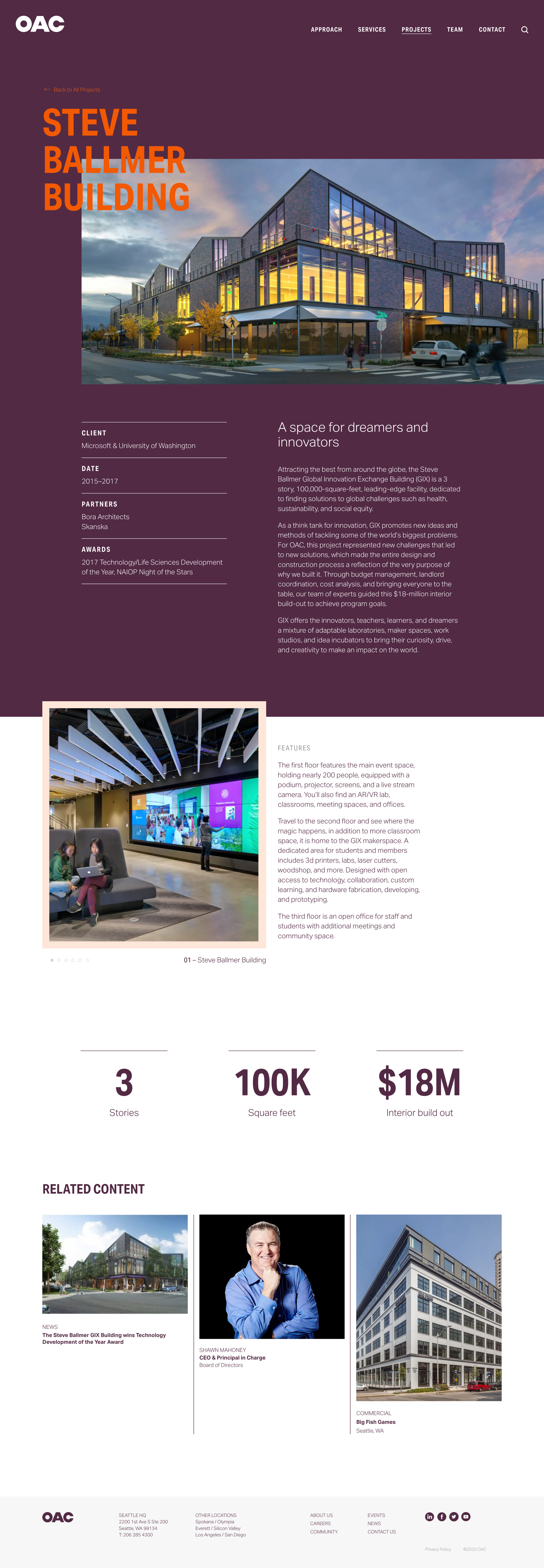
OAC was on a path of rapid growth with plans to expand its services and marketing efforts. Their first priority was a website to support future expansion and new marketing strategies. It needed to serve as a sales tool to showcase projects, a recruitment tool to attract quality candidates, and as an event platform to strengthen OAC as community leaders.
DISCOVER
Information Gathering
Competitive Audit
User Personas
DEFINE
User Journeys
Site Architecture
Information Architecture
Wireframes
DESIGN
Mood Boards
Design System
Pattern Library
Interaction Design
DISCOVER
I collaborated with the strategy team and synthesized 10 interviews with stakeholders and clients. The interviews revealed an opportunity to position OAC as a source of emotional relief elevating their relational strengths. Users are often under a lot of stress, working on high stake projects with challenging deadlines and dysfunctional teams. 92% of revenue comes from returning clients, and 64+% of new work is referral-based, so we knew that the majority of users had a level of familiarity with OAC.
I also conducted a competitive audit to gain insight into OAC's market and the key players they were up against. The audit helped the team understand how competitors positioned themselves. It also revealed industry trends for areas such as project galleries and human resource recruitment pathways.
"In the past, jobs were about muscles, now they’re about brains, but in the future, they’ll be about the heart.”
—OAC Client
DEFINE
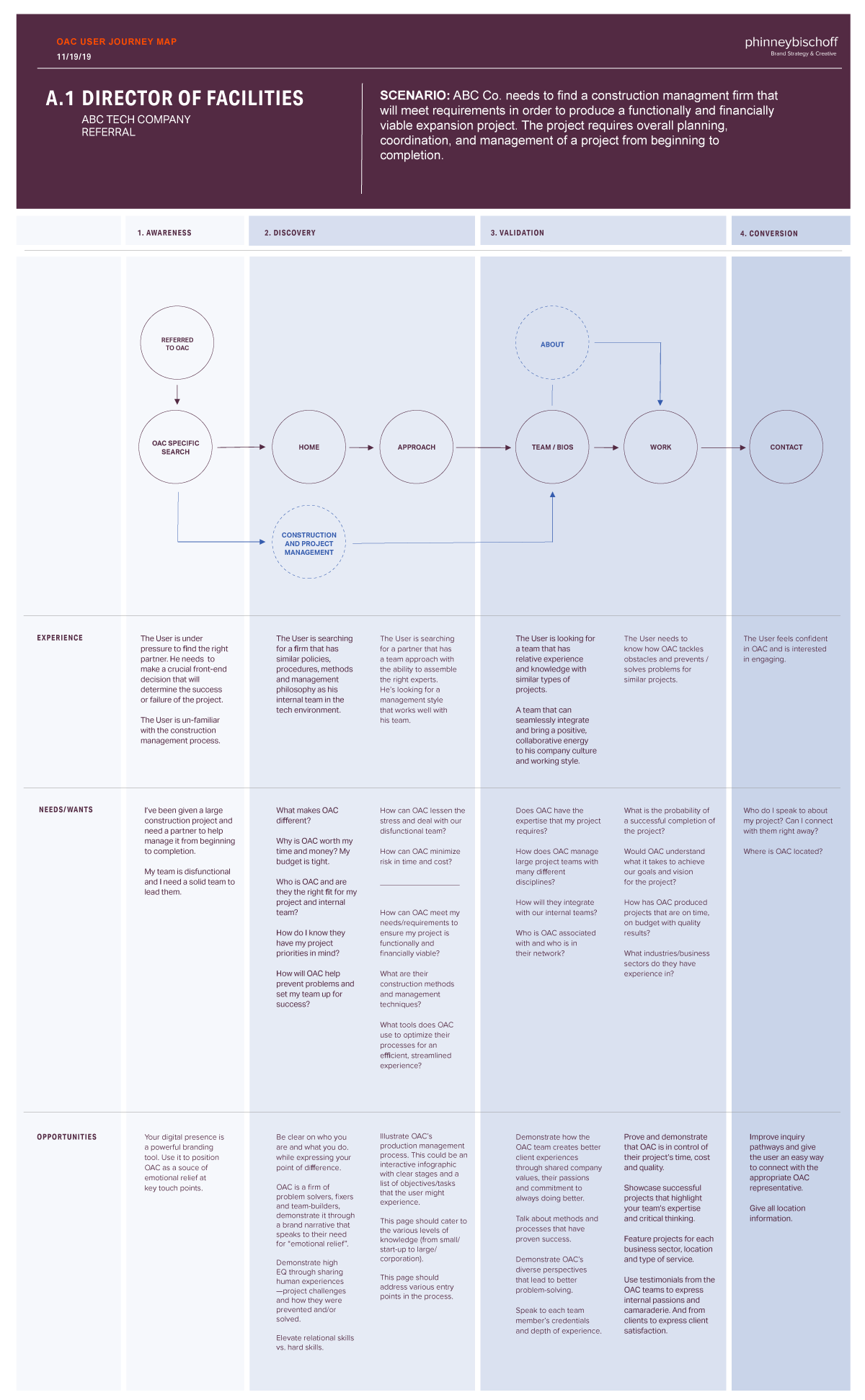
I created flow diagrams to illustrate how each user would navigate through the site. They were structured with four stages in their journey — awareness, discovery, validation, and conversion. I considered how the user entered the site, what their needs/wants are, emotional mindset, identified opportunities, and what action we would want them to take.
Primary users may enter the site with a level of familiarity with OAC but they also have an immediate need to build a team for an urgent project. Here are a few user questions that needed solving.
“Who is OAC, and are they the right fit for my project and internal team?”
“What are their construction methods and management techniques?”
“Does OAC have the expertise that my project requires?
This user was looking to validate OAC as their right partner. A direct path to OAC services and an easy way to discover relevant case studies and team bios brought them closer to conversion.
After mapping out the user journeys, I built the site map and information architecture. The IA helped to identify content groupings, hierarchy, content types, and key features. I created lo-fi wireframes to map out the content types and linking strategy. Annotations for heading styles and word counts served as a guide for the copywriter.
DESIGN
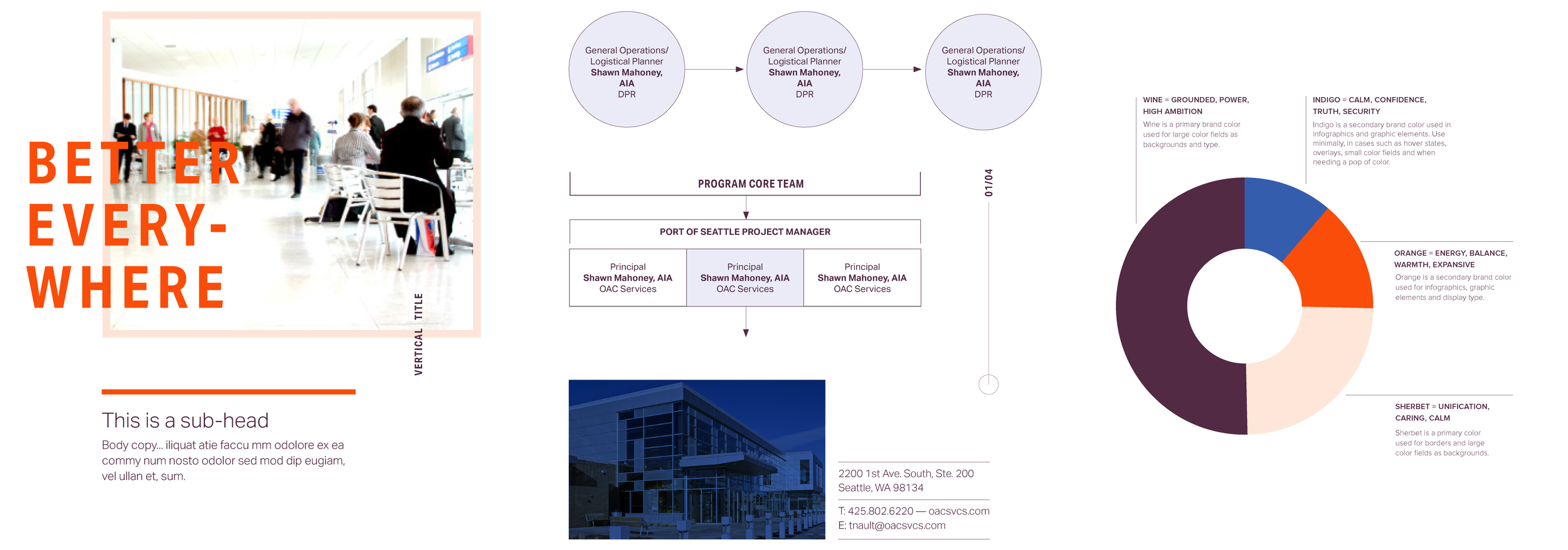
I developed a visual language that embodied OAC's new brand essence and personality. The color palette is bold and unexpected evoking a sense of groundedness, warmth, and calm. Images capture authentic moments of teamwork and convey a sense of ease and confidence.
The design system is built with reusable elements that formed a cohesive library of components. It is scalable and can be used across various marketing tools such as proposals, promotional materials, social, digital, and presentation decks.
BRAND ESSENCE
BETTER. EVERYWHERE.
PERSONALITY TRAITS
Brilliant / Driven / Honest / Adaptable / Curious
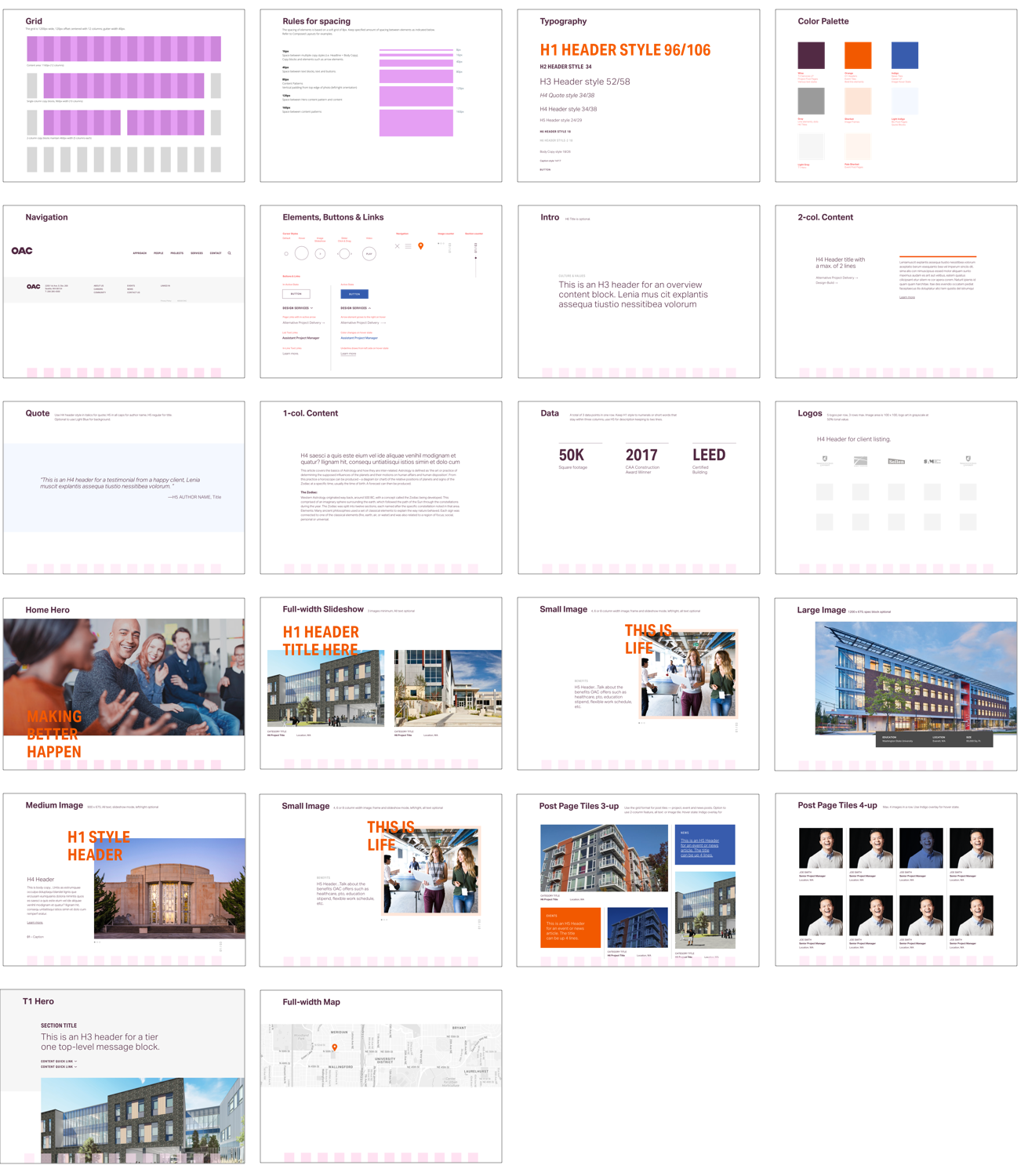
PATTERN LIBRARY


